Are iPhone and Android Emojis the Same? A Thorough Comparison
Explore how iPhone and Android emojis compare across Unicode mapping, rendering, color palettes, and updates. Learn practical tips for cross-platform communication and design to minimize miscommunication.

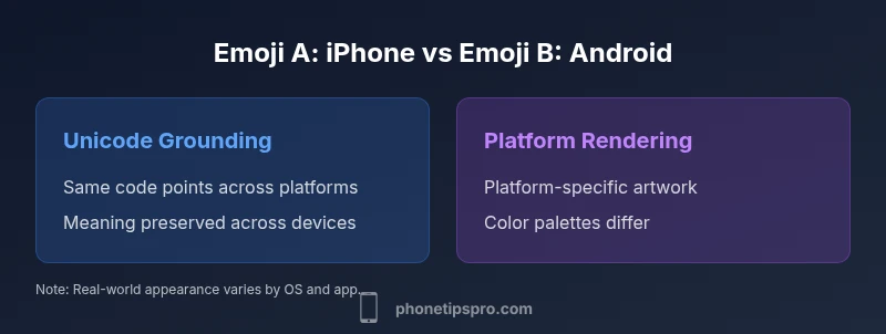
Are iPhone and Android emojis the same? In short: not exactly. They share the same Unicode code points, but rendering, color palettes, and platform-specific design differ by UI and OS version. The question 'are iphone and android emojis the same' matters for readability, cross-platform conversations, and UI design. This article breaks down the core distinctions and how to handle them.
Are emojis the same by Unicode?
The heart of the emoji question is Unicode. Every emoji character has a code point, and that code point is intended to identify a particular idea or face. In practice, the same emoji glyph—conceptually—exists on iPhone and Android because both platforms commit to the same Unicode set. This means that when you send a classic emoji like a smiling face, the recipient’s device will show a glyph sourced from Unicode. However, the user-visible result is heavily influenced by the platform’s font and rendering pipeline. Consequently, the user experience of that emoji can diverge even though the underlying data is identical. This section helps frame why the alignment is about meaning (the code point) but not necessarily visual parity. For the most part, the core meaning is preserved across platforms, which is why the broader answer to the question remains nuanced rather than absolute.
Rendering, color, and font differences
Rendering is where the biggest gaps appear. iPhone uses Apple Color Emoji as its native rendering, delivering a glossy, highly saturated look with distinctive shading and outlines. Android ships with its own color emoji font stack, most commonly the Noto Color Emoji family, which produces a different aesthetic, shading, and line work. When you compare the same emoji on iOS vs Android, you’ll notice differences in color accuracy, edge curvature, and subtle shading. These differences aren’t about meaning; they’re about visual identity. Designers must account for these disparities when creating cross-platform experiences to avoid misinterpretation or a jarring user experience. In practice, you should test across multiple devices to understand how a given emoji will appear in real-world chats and captions, especially in user-generated content where legibility matters.
Apple vs Google: design philosophies
Apple’s design language favors a rich, saturated aesthetic with smooth gradients and a slightly rounder silhouette for many faces. Google’s approach leans toward flatter shading with more pronounced outlines in some emoji families, resulting in a different “feel” for the same symbol. This divergence is part of each platform’s broader visual language. While both interpretations map to identical Unicode points, the emotional or cultural cues conveyed by the design can shift subtly depending on the viewer’s platform. This matters for branding, onboarding, and marketing where consistent sentiment is important. If your product relies on emotional cues from emoji usage, you’ll want to document which platforms present which variants and how users might perceive them differently.
Skin tone modifiers and diversity
Unicode skins tones provide a standardized mechanism to offer varied appearances for many emoji families. In practice, the way skin tones render—how they mix with base emoji, the color transitions, and the selection of modifier glyphs—varies by platform. Some emoji groups have broad modifier support, while others do not. As a result, conversations may look subtly different depending on whether the emoji is presented with a default tone or a skin tone modifier. For teams, this means designing fallbacks or messaging guidelines that consider potential visual variations across devices. It’s also wise to communicate clearly in product content when a specific tone or version of an emoji is essential to meaning or branding.
Updates and cadence: how fast emoji evolve
Emoji updates follow a cadence tied to Unicode releases and platform-specific adoption schedules. New emoji are introduced by Unicode, then each platform implements and updates its font sets in its own release cycle. That means new symbols may appear on iOS and Android at different times, creating short-lived cross-platform gaps. If your app or service relies on the latest emoji for features or onboarding, plan for phased rollouts and notify users about any temporary inconsistencies. Staying informed about both Unicode updates and platform release notes is essential for planning and communication strategies. The practical implication is that even if two platforms add the same emoji, their debut timing can differ, affecting consistency for new users.
Cross-platform messaging: practical impacts
For everyday messaging, users are accustomed to variation. In some contexts, a perceived mismatch in meaning may arise when an emoji looks different but still conveys the same intent. In others, the opposite occurs: a symbol that seems benign on one platform can appear aggressive or ambiguous on another due to color contrasts or facial cues. When you design cross-platform experiences—whether in messages, onboarding flows, or marketing materials—consider providing accompanying text when critical symbols are used. This reduces ambiguity and strengthens cross-platform comprehension, especially for diverse audiences and international users. Clear guidelines help content teams keep the message consistent even when the glyphs differ visually.
Accessibility and readability considerations
Accessibility aims to ensure everyone can understand content regardless of device. Emoji rendering can complicate screen reader output and alt-text expectations. Provide meaningful text alternatives for emoji-laden UI elements, and ensure that color alone doesn’t carry essential meaning. When possible, pair emoji with descriptive text or use accessible labels (aria-labels) in interactive components. In multilingual contexts, consider whether an emoji’s meaning remains stable or shifts with cultural norms, and adjust alt text accordingly. Alt text should describe intent rather than replicate the visual, helping users who rely on assistive technologies understand the message.
Practical tips for designers and developers
If you’re designing an app where emoji presentation matters, establish cross-platform standards early. Create a design guide that documents which emoji appear in your UI, and specify whether you’ll show platform-specific glyphs or a unified custom glyph set for critical icons. For apps that rely on user-generated content, consider implementing fallbacks or text-based alternatives to preserve meaning when a glyph appears differently across devices. When possible, test with real devices (iOS and Android) and collect feedback on perceived tone, readability, and clarity. Document results and update your guidelines as new emoji releases roll out. This approach minimizes misinterpretation and enhances user experience across platforms.
Testing and validation across devices
Thorough testing is essential for emoji-rich experiences. Use a matrix of devices and OS versions to capture rendering differences as early as possible. Automated tests should verify that critical messages convey the intended meaning even if the emoji glyph changes. Consider including locale-specific tests because cultural associations with certain symbols can vary by region. Build a simple cross-platform emoji QA checklist to ensure that a message’s intent remains clear regardless of the device or emoji style. Finally, gather user feedback and iterate—emoji design and availability continue to evolve with each Unicode release.
Case studies: real-world chats and apps
Some messaging platforms choose to render platform-native glyphs to preserve brand familiarity, while others opt for a unified glyph set to minimize visual churn. In social apps, users may perceive differences in tone when the same emoji appears in iOS and Android chats. A well-documented emoji policy helps teams maintain consistency across features, support channels, and onboarding copy. By analyzing real-world conversations and support inquiries, you can identify which emojis most frequently trigger misinterpretation and adjust guidelines accordingly. The outcome is better clarity, fewer misunderstandings, and a smoother cross-platform user journey.
Future trends in emoji design and standardization
Emoji design is continually evolving, with growing emphasis on accessibility, inclusion, and expressiveness. We can expect more platform-agnostic emoji styles, richer skin-tone modifiers, and potentially new mechanisms for conveying tone without relying solely on symbol appearance. Teams should stay vigilant for Unicode updates, platform previews, and developer documentation that explain how new emojis will render in their apps. Proactively adopting these trends can help maintain cross-platform clarity and improve long-term maintainability of emoji-heavy interfaces.
Quick-start guidelines for teams
- Document which emoji styles your product uses and why (platform-native vs unified glyphs).
- Create an emoji policy aligned with your brand voice and accessibility needs.
- Build a cross-platform testing plan covering iOS and Android devices across recent OS versions.
- Include text alternatives or tooltips for critical symbols to ensure meaning remains clear.
- Establish a review cycle tied to Unicode releases to anticipate rendering changes and plan communications accordingly.
Comparison
| Feature | iPhone Emoji Set (Apple) | Android Emoji Set (Google) |
|---|---|---|
| Unicode code points | Same code points across platforms | Same code points across platforms |
| Visual design | Apple Color Emoji style with saturated, glossy look | Noto Color Emoji / platform fonts with flatter shading |
| Color rendering | Distinct color palette and shading | Distinct color palette and shading with platform variations |
| Skin tone modifiers | Supports many modifiers; appearance varies by glyph | Supports many modifiers; appearance varies by glyph |
| Emoji availability | Updates tied to Apple releases; sometimes earlier on iOS | Updates tied to Google releases; sometimes earlier on Android |
| Cross-platform consistency | High for meaning, moderate for appearance | High for meaning, moderate for appearance |
Positives
- Clarifies how emoji meaning remains consistent across platforms
- Helps designers anticipate visual differences and plan fallbacks
- Guides developers in choosing between native vs custom glyphs
- Improves cross-platform communication and user experience
Weaknesses
- Does not guarantee identical visuals across devices
- Requires ongoing maintenance with Unicode and platform updates
- Can complicate branding when platform-specific glyphs diverge
Cross-platform emoji visuals will differ; Unicode meaning remains stable
Emoji meanings are consistent across iPhone and Android due to Unicode code points, but appearances vary by platform-design and rendering. Plan for visual differences and use text fallbacks when precision is critical. This approach minimizes miscommunication while preserving brand and UX quality.
FAQ
Do Emoji code points map the same across iPhone and Android?
Yes. Emoji characters share Unicode code points across platforms, ensuring basic meaning remains constant. Visual differences arise from design choices and rendering. This separation of data versus appearance is why the phrase 'are iphone and android emojis the same' often comes up in discussions about cross-platform UX.
Yes—the code points are the same, but the visuals differ due to platform design.
Why do the same emoji look different on iOS and Android?
Differences stem from distinct typefaces and color emoji fonts used by each platform. Apple uses its own Apple Color Emoji, while Google uses a separate font set. The same symbol can appear with different color shading and outlines, even though the underlying code is identical.
Different fonts and color palettes cause the look to differ.
Are there emojis that exist on one platform but not the other?
Yes, there can be platform-specific emoji additions that appear in one environment before the other. When new symbols are introduced, there may be a lag before both platforms adopt them. This is another reason to test cross-platform UX after Unicode releases.
Sometimes a new emoji shows up on one platform first, then the other.
How often are emoji updates released on iPhone and Android?
Emoji updates occur on both platforms after Unicode releases, but the timing varies by platform. Apple and Google deploy updates in their own cycles, which can create temporary gaps in unified emoji availability across devices.
Each platform updates on its own schedule after Unicode releases.
What can I do to ensure emoji consistency in apps?
Use a consistent rendering approach, such as a shared glyph set for critical symbols, and provide descriptive text alongside emoji where precision matters. Regular cross-device testing helps catch misinterpretations early in the product cycle.
Provide fallback text and test across devices to stay consistent.
Is there a universal standard for emoji design?
Unicode standardizes the meaning and code points, but there is no single universal visual design for emoji. Platform designers retain control over how each symbol appears, which is why appearance varies across iPhone and Android.
Unicode standardizes meaning; visuals vary by platform.
Quick Summary
- Rely on Unicode for meaning, not appearance
- Expect design differences between iOS and Android glyphs
- Test emoji rendering across devices before launch
- Provide text alternatives for critical symbols